UI/UX
•
Video
•
Print Material
•
Digital Assets
UI/UX • Video • Print Material • Digital Assets
About me
Hey!
It’s Marina. I’m a multidisciplinary designer with 7 years of experience across different industries.
I started out as a freelancer, working with clients and small businesses across the UK, EU, and USA, which really helped me push creative boundaries and discover what I enjoy most about design. Over the past 4 years, I’ve been working in corporate design and currently enjoy my role as a Senior Global Creative Designer at Morgan Stanley, creating impactful design solutions while working within strict brand standards.
At the same time, I lead Dishly, a personal project where I get to design everything from user research and UX flows to UI and visual branding, working closely with a developer. It’s a space that allows me to stay up to date with new disciplines, tools, and techniques, while continuously refining my design skills. I’m passionate about crafting intuitive, engaging experiences and love finding new ways to make design meaningful and enjoyable.
Morgan Stanley
Finance
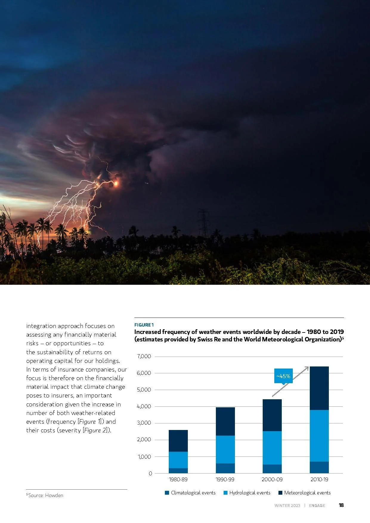
My Daily Design Practice
As a Global Creative Designer, I specialise in multilingual design and localisation, adapting elements such as date formats, units of measurement, spelling, and legal information for each market. I frequently work independently to manage end-to-end creative delivery for EMEA, LATAM & US requests, directly liaising with internal teams and clients to ensure projects are executed to global standards.
High-Volume Production: Recognised for exceptional productivity, consistently delivering a large volume of high-quality creative assets under tight deadlines while maintaining brand consistency across all channels.
Independent Client & Team Management: Regularly handle requests from teams and stakeholders independently, managing communication, creative strategy, and delivery without the need for escalation.
Visual Content Development: Create digital assets including imagery, logos, charts, ads, banners, and HTML email templates, as well as layout designs for advertisements, brochures, reports, and prospectuses, supporting Morgan Stanley’s global investment teams in both digital and print.
Brand & Video Support: Provide guidance on brand use in video production and develop thumbnails for video deployment across multiple platforms.
Imagery Selection & Retouching: Source imagery within budget constraints and retouch headshots, ensuring a polished and consistent look across teams.
Event Materials: Design impactful assets for in-person and virtual events, including agendas, certificates, pull-up banners, social content, and large-scale displays, enhancing engagement and creating memorable experiences.
Templates & Guidelines: Contributed to the development of templates and brand guidelines, balancing creativity with precision and ensuring strict compliance with corporate standards.
My role harmonies creativity, meticulous attention to detail, and strict adherence to brand guidelines, delivering visually cohesive and brand-aligned materials across a wide spectrum for Morgan Stanley Investment Management.
Print Material
Marketing Collateral


This type of material is in high demand among the teams. See some examples I created, Fixed Income, Private Credit, and International Equity.

Digital Material
Digital Assets


Luminance
AI-Driven Software
Here’s What I’ve Been up to
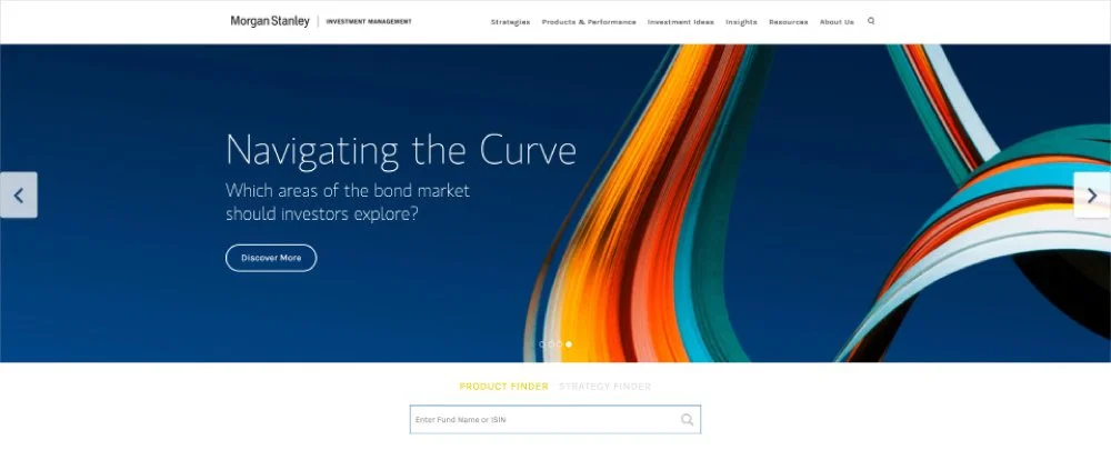
I contributed to the design of the company’s website landing page, applying my UI/UX expertise to create a more intuitive and engaging user experience. Working within the marketing and design department, I collaborated closely with cross-functional teams to ensure brand consistency and visual impact across all touchpoints.
My work spanned a broad range of visual materials, including corporate collateral, digital banners, advertisements, presentations, infographics, event assets, and photographic content for social media and other platforms. Each piece was carefully crafted to align with the company’s branding guidelines, strengthen its visual identity, and communicate key messages clearly and effectively.
Print Material
Marketing Collateral


Corporate Presentations
Executive Decks


Digital Material
Digital Assets


UI/UX Design
Landing Page
Luminance is a London-based AI company that is transforming the legal industry through advanced machine learning. By streamlining tasks such as contract review and compliance, Luminance significantly reduces the time and cost associated with complex legal processes.
As a Visual Designer at Luminance, I supported the team across various projects, including UI Design, ensuring cohesive and effective design solutions.
This landing page was created to promote events and drive user registrations, with a clear call to action aimed at encouraging subscriptions.

-
A selection of the awards the company has received in recognition of its industry-leading work, underscoring our credibility, expertise, and commitment to excellence. These honours highlight our position as a trusted leader in the field, reinforcing the quality and innovation that drive our success.
-
A preview of three upcoming events designed to attract new customers, engage and motivate existing ones, and strengthen overall brand loyalty, encouraging continued use of the service.
-
An engaging overview of your three products, highlighting their unique features and benefits to spark interest and create a clear customer need for the service.
-
Additional information presented in a graphic format for easy readability and direct communication, complemented by a map showing the countries where customers are already using Luminance services. The footer includes copyright details and links to our main social media profiles.
DC Advisory
Finance
Corporate Video
Corporate video introducing the brand and showcasing its identity through carefully applied brand guidelines and visual elements. The piece combines animations and motion effects to create an engaging and dynamic representation of the brand’s personality.
Dishly
Network
I handle a full spectrum of product design tasks, from user research to wireframing and prototyping, ensuring solutions meet real user needs. I craft user flows, design icons and logos, and develop cohesive multi-platform UI systems. I also conduct usability testing, write interface copy, and manage branding to deliver a seamless and consistent experience across all touchpoints.

Dishly on Different Devices
Dishly is a platform for food lovers, designed to connect a community of people who love to cook and eat. It offers expert tips, culinary insights, and inspiration from chefs and food enthusiasts alike. Whether you’re a seasoned cook or just enjoy experimenting in the kitchen, Dishly makes it easy to explore, share, and celebrate your passion for food.
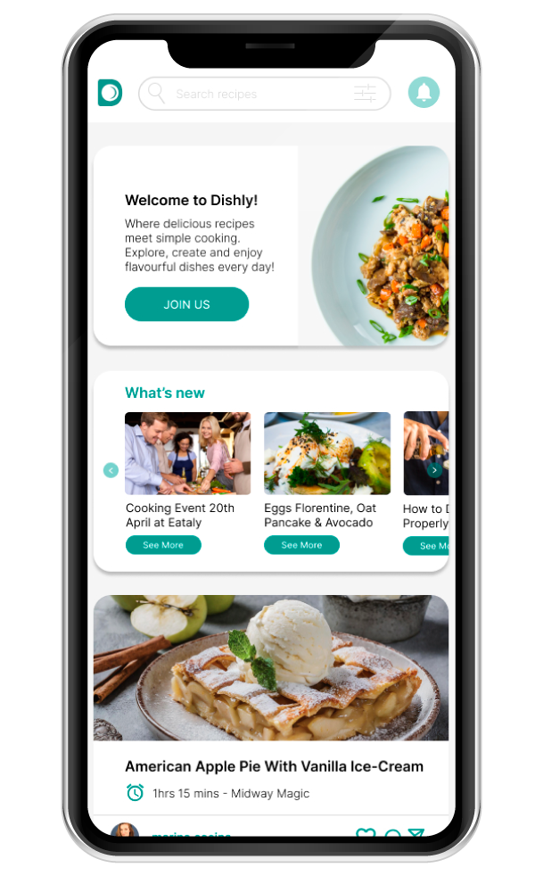
My mission is to craft user experiences that truly resonate. I leverage user research to inform design decisions, creating apps that balance intuitive functionality with visually engaging interfaces. By defining user flows, interaction patterns, and information architecture, I optimize the user journey and deliver seamless, engaging experiences. Dishly is designed to inspire users to explore, share their culinary creations, and connect with a community of food enthusiasts, making it a product that is both functional and delightful.
Enola Nature Cosmetics
eCommerce
Rebranding
-
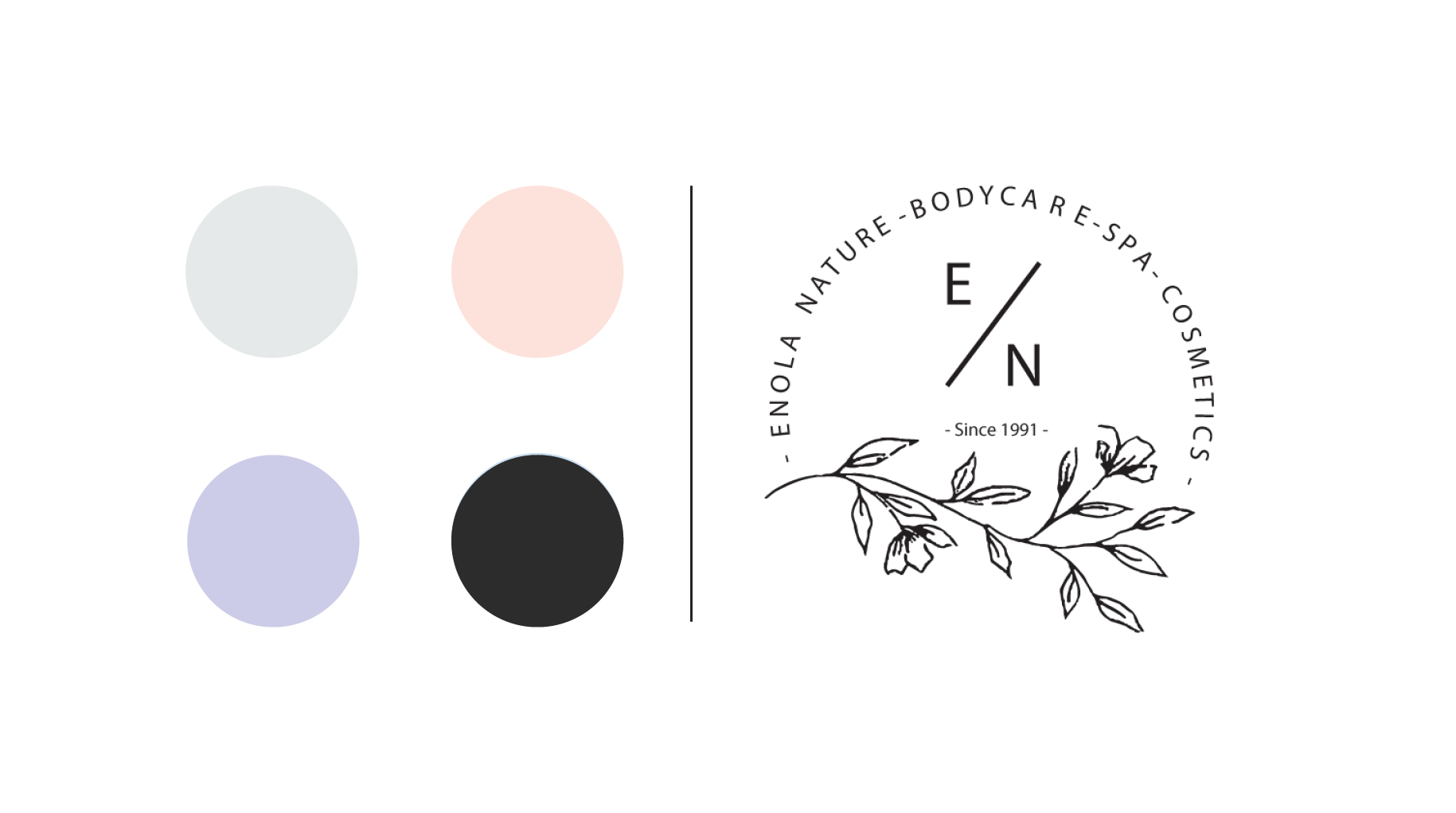
Before
I selected Myriad Pro for this project due to its versatility, clarity, and professional appeal. As a neutral, humanist sans-serif, it offers excellent legibility across both digital and print mediums, making it a dependable choice for consistent design delivery. Its simplicity ensures the content remains the focal point while delivering a polished and timeless aesthetic. While widely used, its popularity highlights its effectiveness in communicating clear, accessible messaging without detracting from the design.
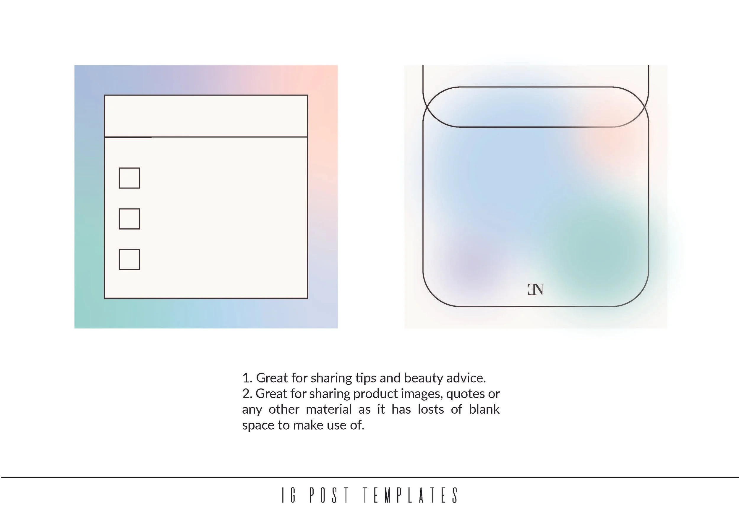
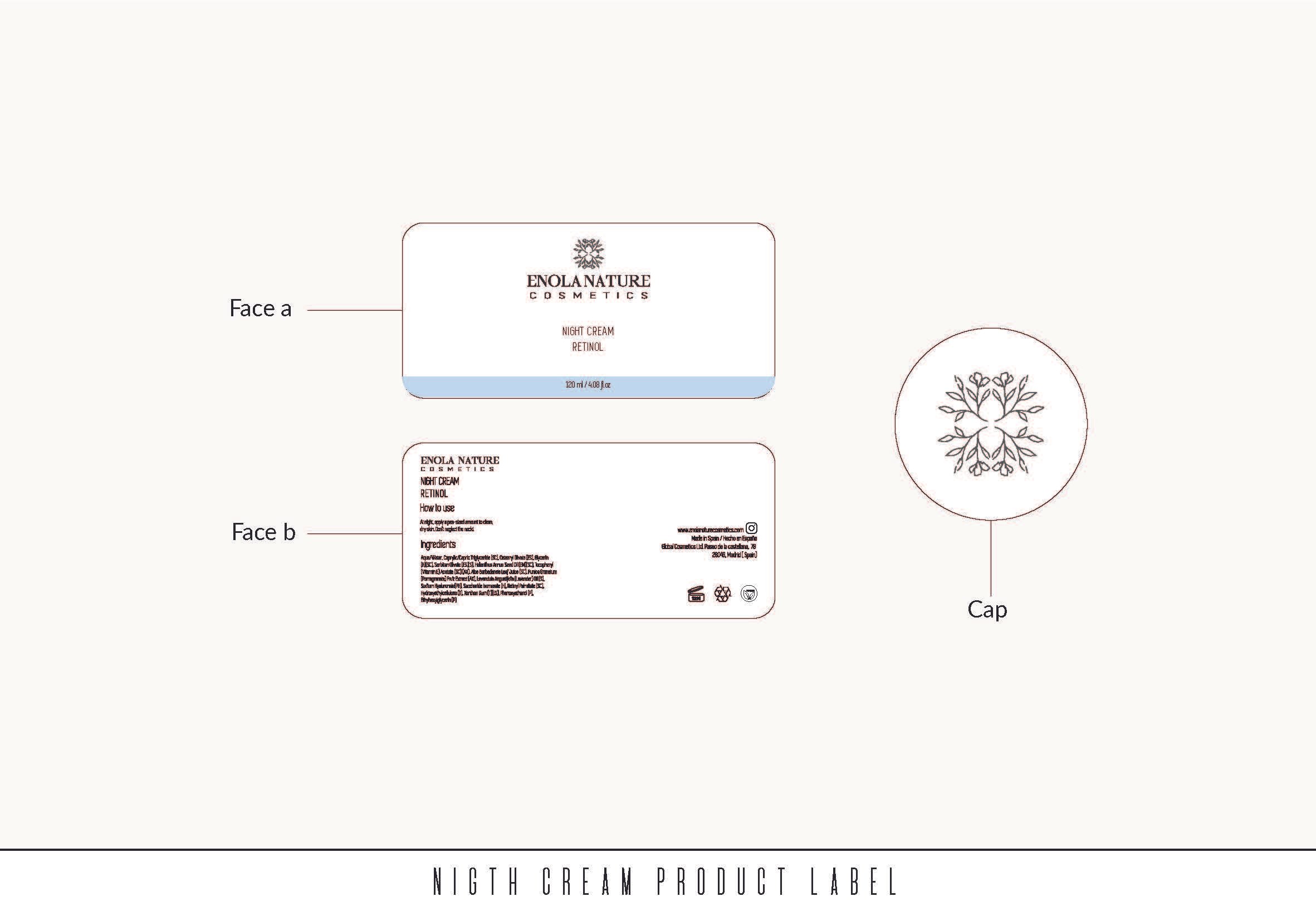
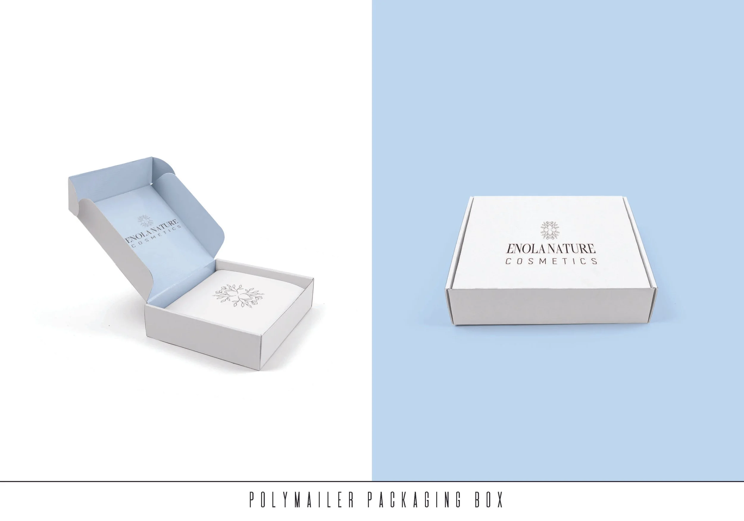
For this project, I was responsible for building the brand from the ground up, including logo design, branding, product labelling, and illustration—all tailored to the client’s brief. My goal was to craft a cohesive visual identity that embodies elegance, naturalness, and quality, resonating with the brand’s values and its target audience.
-
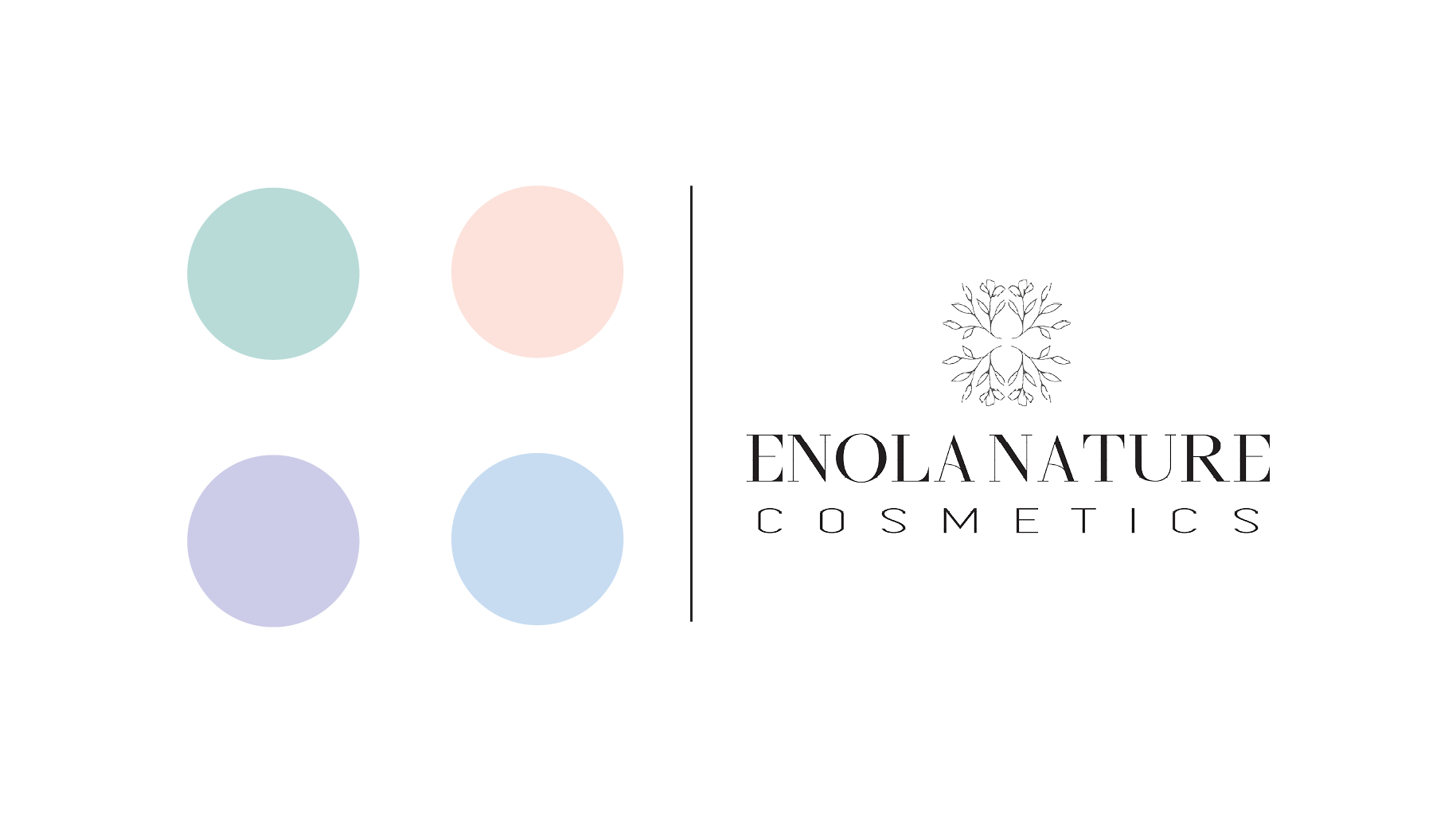
After
My role was to revitalise the company’s brand identity for a new product launch, blending a fresh, modern look with the core essence of the brand. I introduced a pastel blue for packaging, tailored specifically for night-time products like Retinol, and updated the typography to Shamery Regular and Simplifica Regular. Shamery’s handwritten charm adds sophistication and a personal touch, fostering an emotional connection with customers, while Simplifica’s clean, minimalist design ensures clarity and professionalism
I also refreshed the illustrations and reimagined a minimalist version of the logo, focusing on highlighting Enola Nature’s initials. Additionally, I designed product packaging, polythene sachets, and labels, and led the UI/UX design of the official website to deliver a cohesive, consistent, and visually engaging brand experience overall.
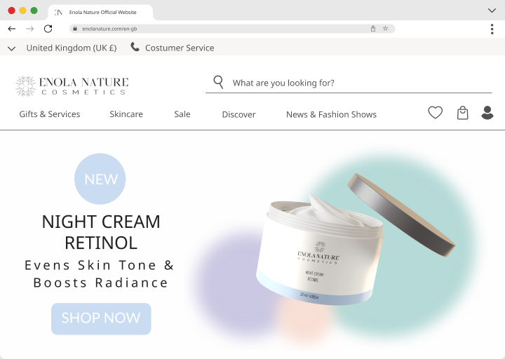
Enola Nature Homepage
The UI/UX design for the Enola Nature Cosmetics website was all about balancing simplicity with functionality. I'm a big advocate of clean, minimalist design that is modern and easy to navigate, making it easy for users to search for products and make purchases.
The site is fully responsive, ensuring it works seamlessly across all devices, and I incorporated SEO best practices to improve its visibility on Google. The end result reflects the brand's identity and offers a user-friendly experience that encourages engagement and increases sales.
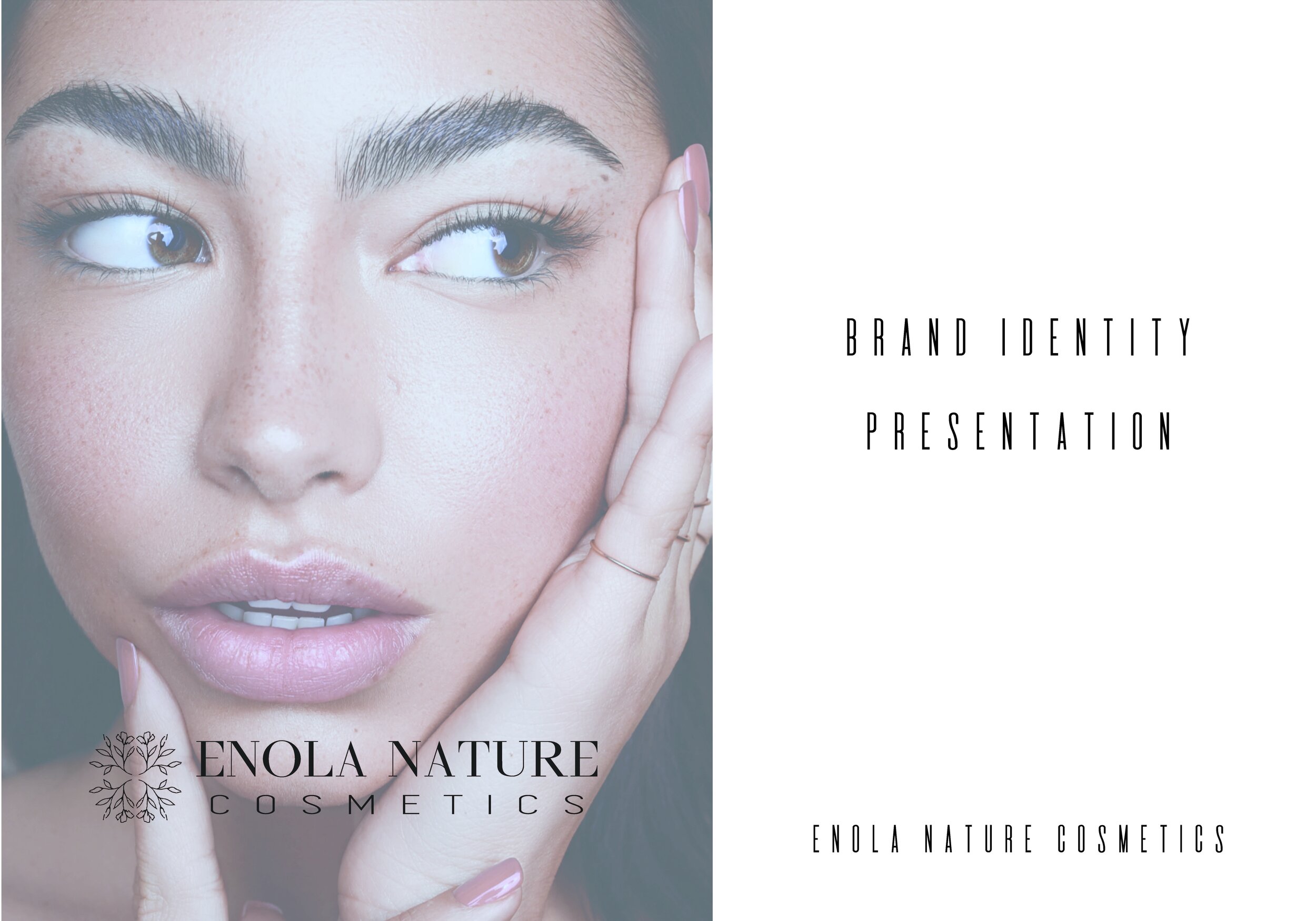
Brand Identity
This is a segment from the presentation I delivered to the client, where I walked her through the key elements of the new branding and explained the creative decisions behind it.


Plant Sweet Home
eCommerce
Home Sweet Plant
Home Sweet Plant
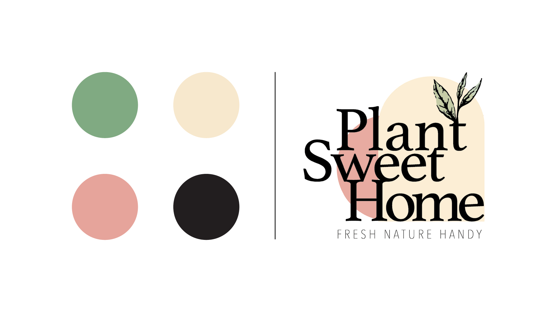
As a result of this project, I was awarded a cash prize to further my design studies. Plant Sweet Home is an online store specialising in plants, substrates, and accessories, with a strong focus on sustainability. The packaging is made from eco-friendly materials, and deliveries are completed using low-emission vehicles, minimising environmental impact and promoting a greener planet.
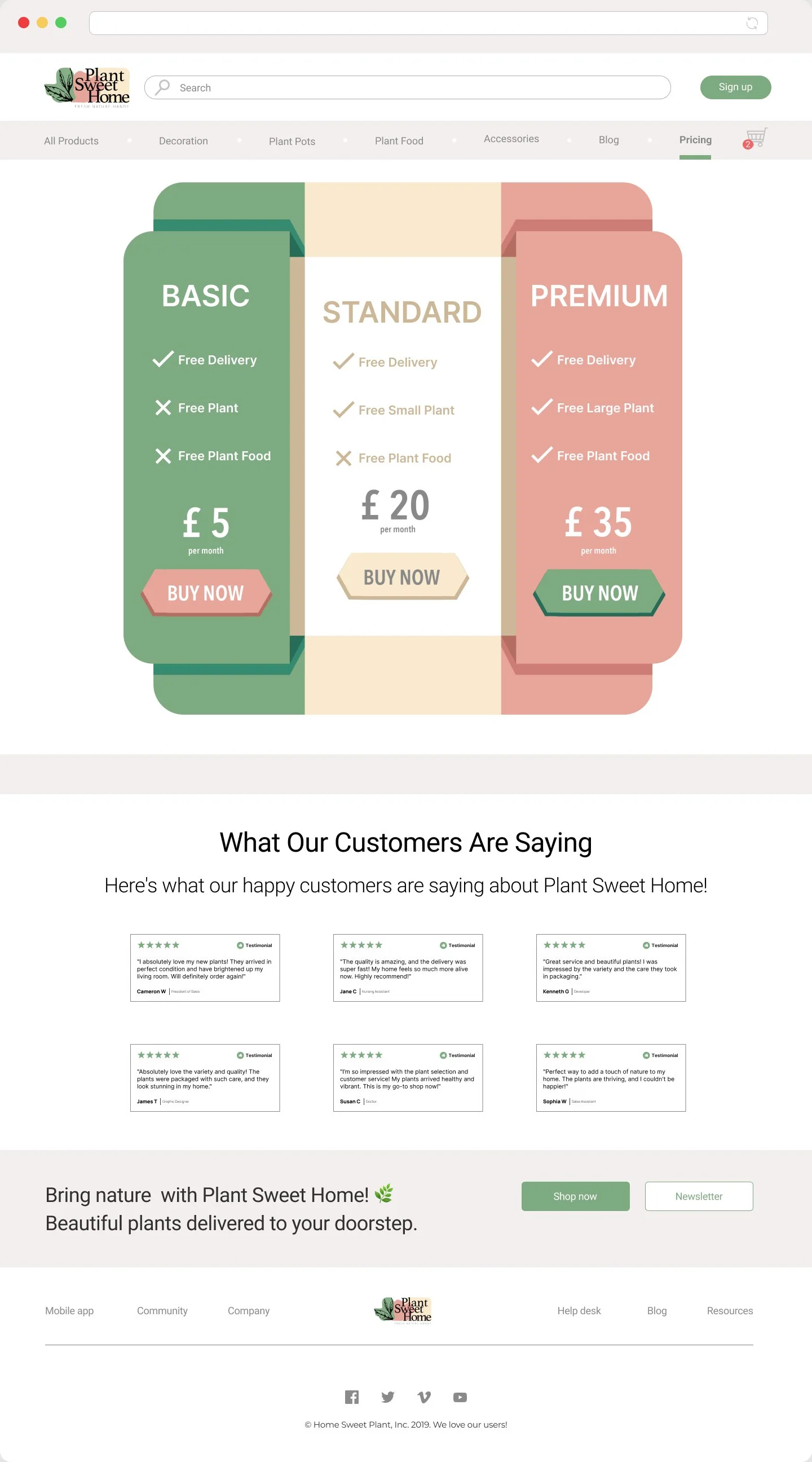
I designed the UI/UX for the Plant Sweet Home website with a focus on simplicity, accessibility, and a seamless user experience. By creating a minimalist, nature-inspired aesthetic, I aligned the design with the brand's eco-friendly ethos. My approach prioritised intuitive navigation, enabling users to explore products and complete orders effortlessly. I also integrated customer testimonials and a newsletter sign-up to build trust and boost engagement.
-
Designed to provide a smooth navigation experience. With clear and concise links to key sections such as Home, Products, Subscription Price List and Blog. This navigation bar is easy to use and allows visitors to quickly access the information they need with a single click, ensuring smooth navigation across the site.
-
I designed this graphic to showcase the subscription prices, leveraging the brand's colours to clearly differentiate between the various plans offered by the company.
-
A compilation of the best reviews and testimonials that users have had.
-
An engaging and persuasive tagline crafted to encourage users to subscribe to the newsletter and take immediate action to make a purchase.
-
To improve the user experience, I placed a range of relevant links in the footer, including contact information, the privacy policy, terms and conditions, and social media profiles. Thoughtfully positioned, these links provide users with quick and easy access to essential resources.
Contact Details
Email
msmarinapm@gmail.com
Phone Number
+44 7377160193
Location
London